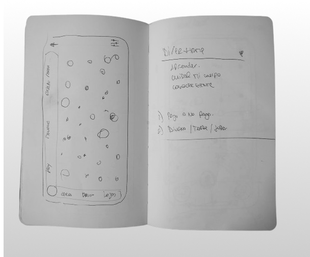
Objective
Create an efficient way to display cultural events happening near the user
Segment
Cultural Agenda
My Role
Ux / Ui Design, Product Design
About
In our busy lives, finding the right events is overwhelming due to cluttered platforms and too much information. The proposed solution aims to simplify event discovery and attendance, simplifying the process of finding events that align with individual interests.
With a user-friendly interface, it offers browsing and filtering options based on preferences. Additionally, it presents event information in an alternative format, ensuring a seamless experience for discovering local cultural activities.
Archetypes

Michael is a sociable intern at an accounting firm who enjoys going out with friends. In his free time, he seeks new experiences and connections. He's interested in exploring cultural events like exhibitions and concerts in his city. Michael relies on smartphone apps for convenience in discovering and customizing his outings, finding enjoyment and community connection through these experiences.

Malena, 22, a nanny and music enthusiast, loves immersing herself in various genres of music. She enjoys attending concerts and music festivals in her free time, using smartphone apps to discover new musical experiences while balancing her work responsibilities.
Benchmark
For the benchmark, I studied Meetup and Eventbrite. While they are not directly focused on cultural events, they share the same objective of informing users about various events. Meetup primarily focuses on facilitating group meetings and activities based on user interests, while Eventbrite serves as a platform for discovering and organizing a wide range of events, including workshops, conferences, and social gatherings. Despite their differences, both platforms embody the essence of connecting users with events that align with their interests and preferences.
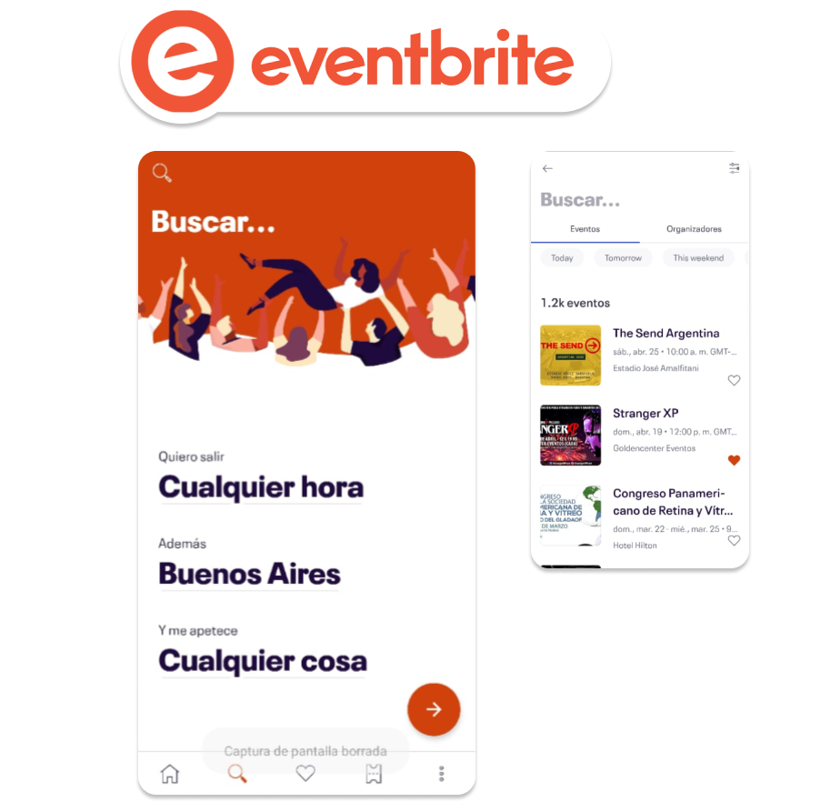
👍Clear Filtering System:
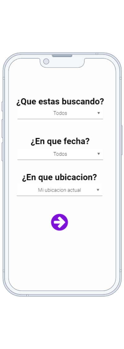
Implemented a user-friendly filtering system with three key variables: location, time, and event type, ensuring ease of navigation and quick access to relevant events.
👍Easy Access to Events of Interest:
Users can easily find events of interest through the intuitive interface, allowing them to discover cultural experiences that align with their preferences and schedule.
👎Inability to Visualize Information on Map: One limitation encountered was the inability to visualize event information on a map. While the filtering system provided efficient access to event details, the absence of a map interface hindered users from visually exploring event locations spatially.
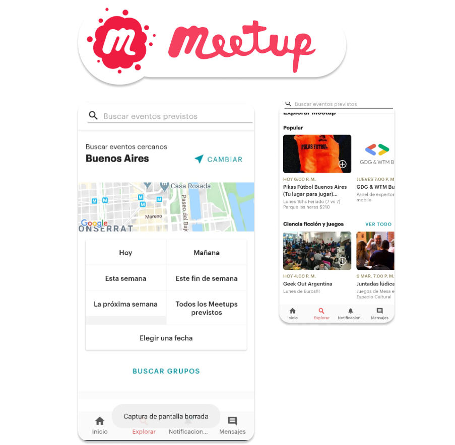
👎Confusing Filtering Interface:
Encountered challenges with a visually confusing and unfriendly filtering system, making navigation difficult for users.
👍Accessible Events:
Despite the interface issues, users could still easily access events of interest, albeit with some effort to navigate through the confusion.
👎Missing Map Visualization:
Similar to previous cases, the absence of a map interface limited users from visually exploring event locations, despite still being able to access event details.
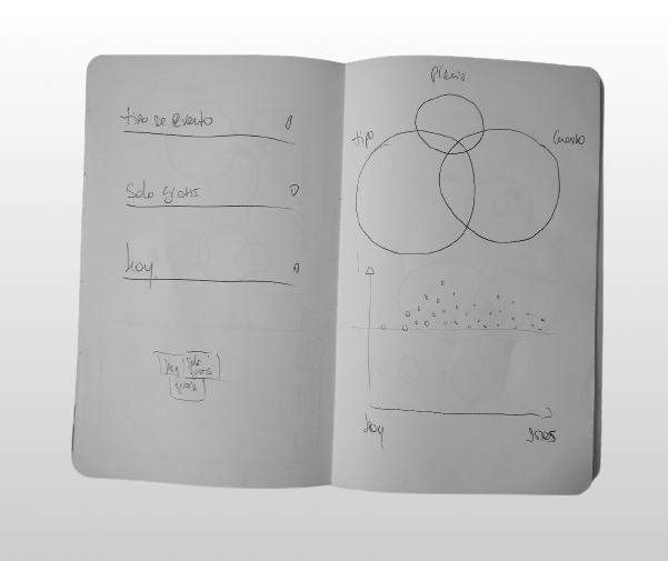
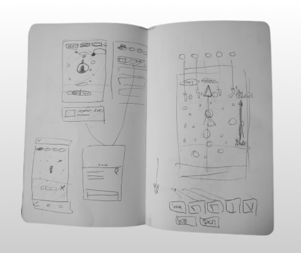
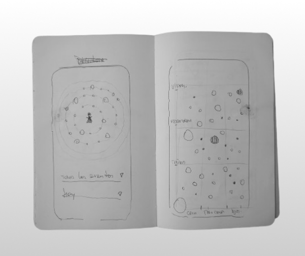
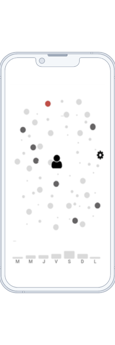
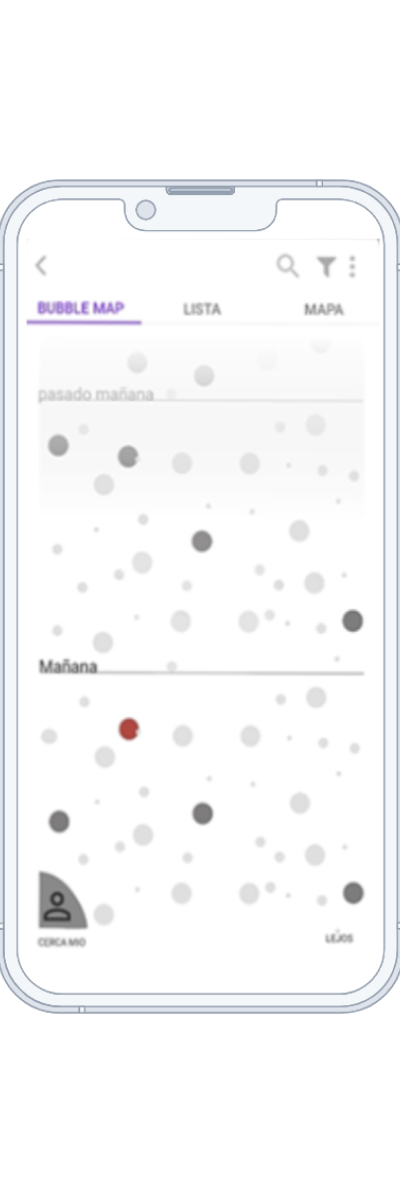
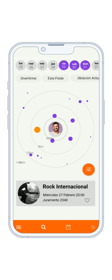
Exploring an alternative data visualization model
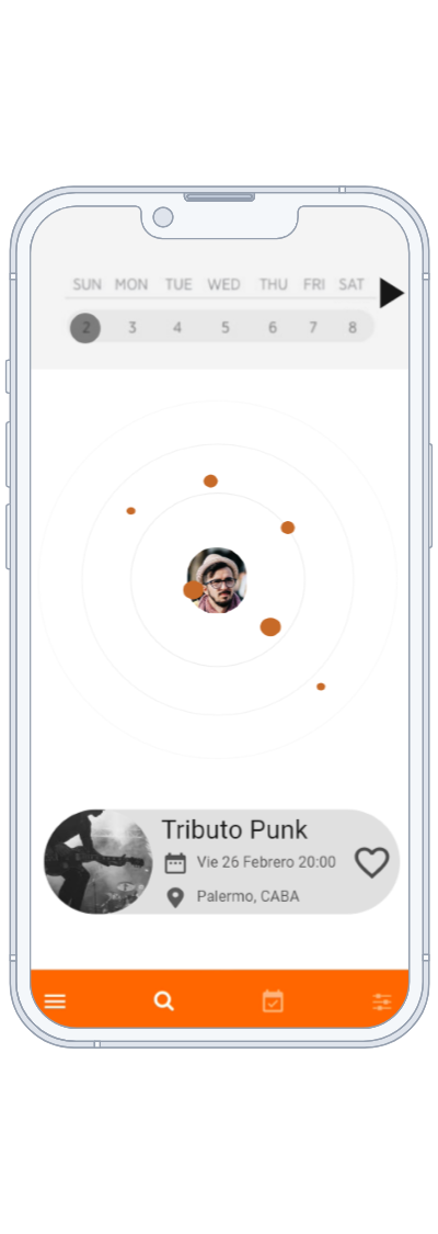
I conducted various explorations to visualize event data, focusing on two main variables: 'where' and 'when.' Firstly, I experimented with the location of the events, aiming to emphasize the metric of distance from my location. This involved designing interfaces that displayed events relative to the user's current position, providing easy access to nearby cultural experiences.
Secondly, I explored different alternatives for visualizing the timing of events. This included consolidating information about when the events would occur. By experimenting with various layouts and formats, I aimed to present users with a clear overview of upcoming events, allowing them to plan their cultural outings efficiently.
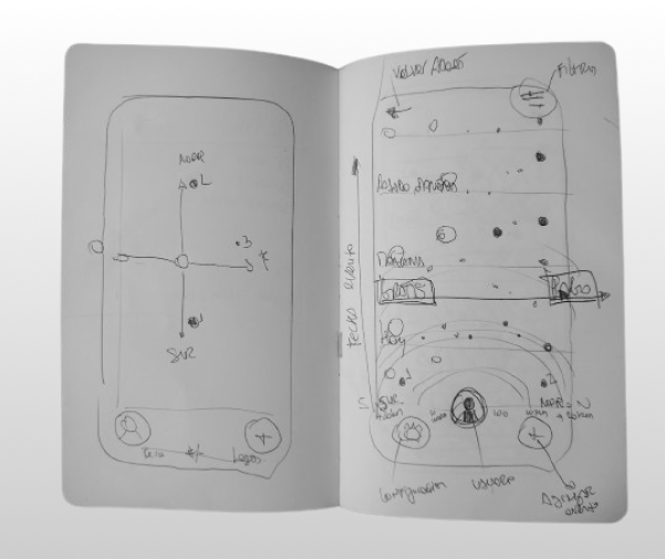

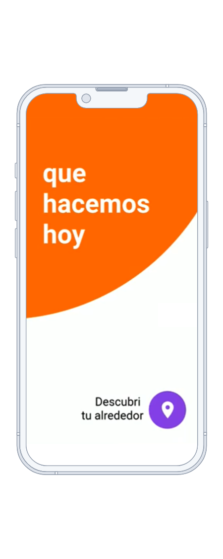
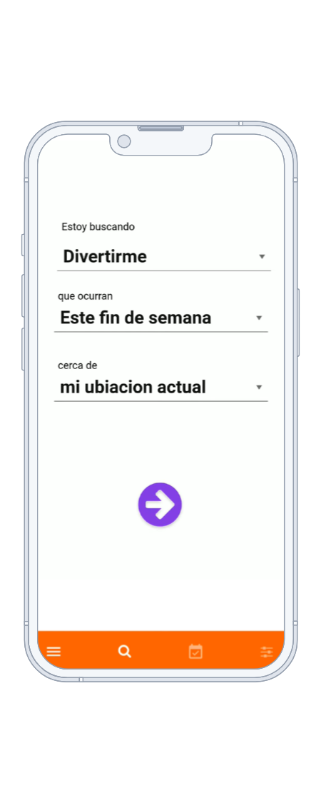
Wireframing & Prototyping
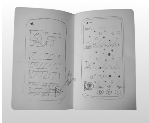
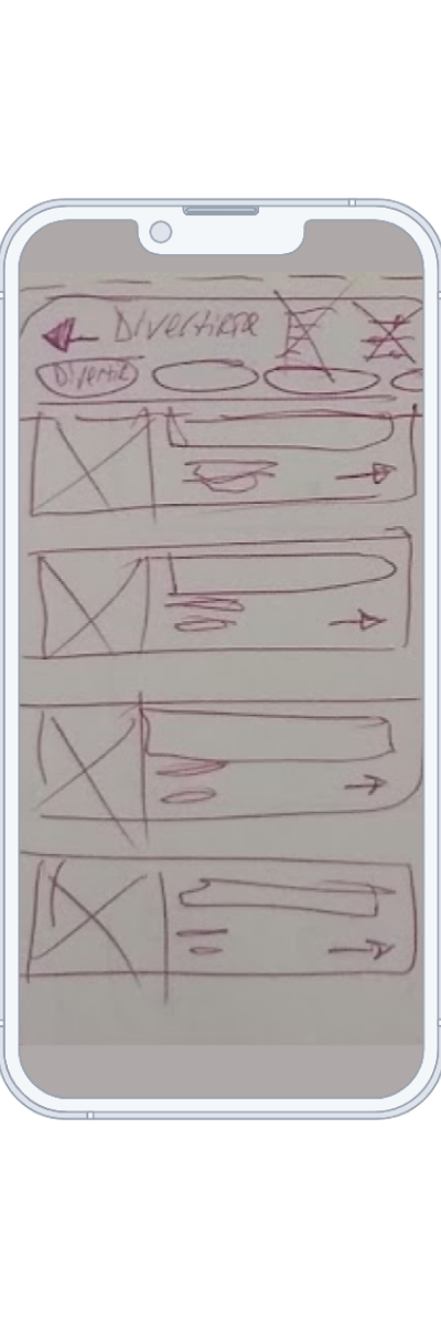
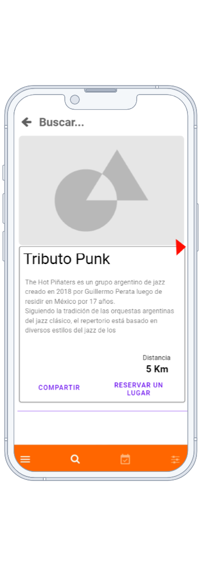
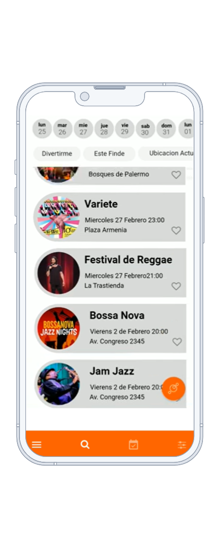
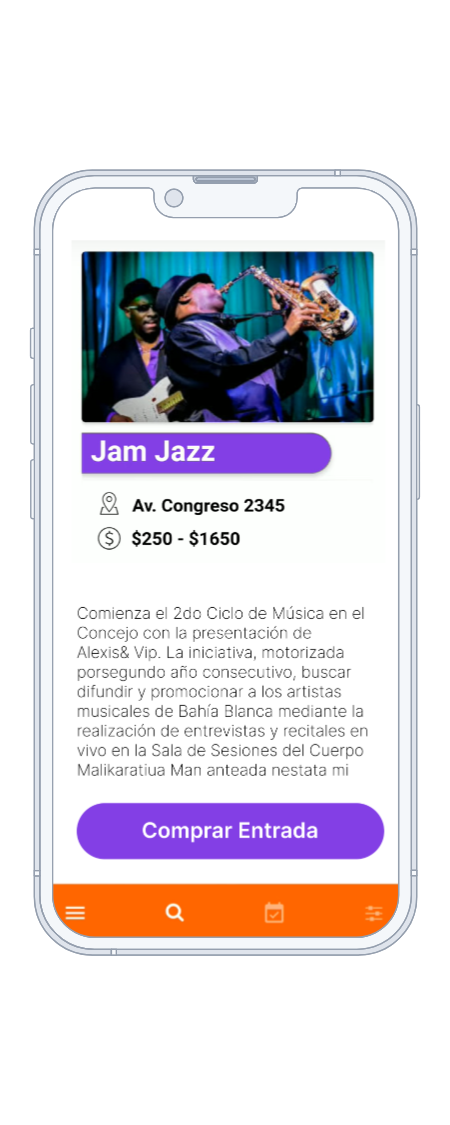
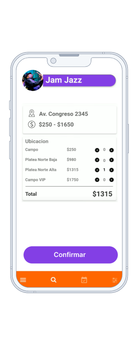
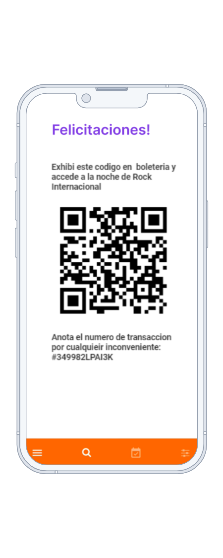
Wire-framing & Prototyping: The process underwent numerous iterations, aiming to discover a new approach to presenting information in a simple manner. As depicted in the sketches above, various alternatives were explored. Below are some of the screens that were prototyped.
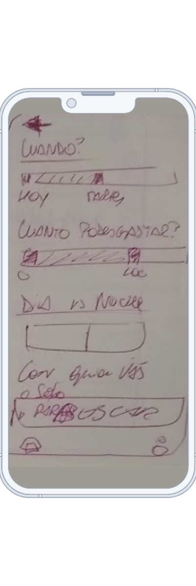
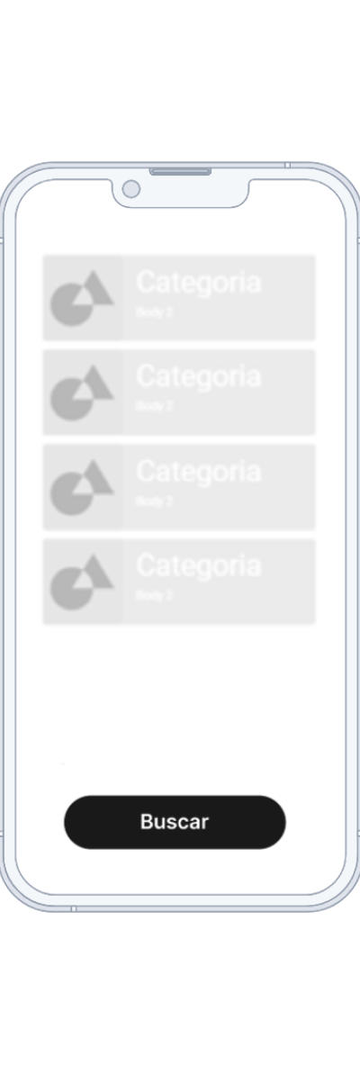
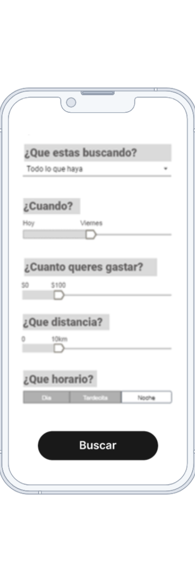
In both the low and medium fidelity stages, the focus was on designing three screens centered around an information filtering system, event listing, and user-friendly interface. During the medium fidelity stage, various filter models were explored. The aim throughout was to achieve agility and simplicity in user interaction.

In both the low and medium fidelity stages, the focus was on designing three screens centered around an information filtering system, event listing, and user-friendly interface. During the medium fidelity stage, various filter models were explored. The aim throughout was to achieve agility and simplicity in user interaction.
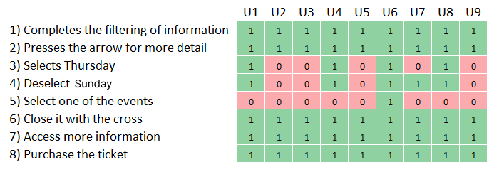
Testing
Users were presented with the following task,
"You are single. Today is Monday, and you arranged a date for Thursday night. Both of you live in the same area. It's the third date, and you need to buy tickets for a music event. There's an application that helps you find events happening near you."
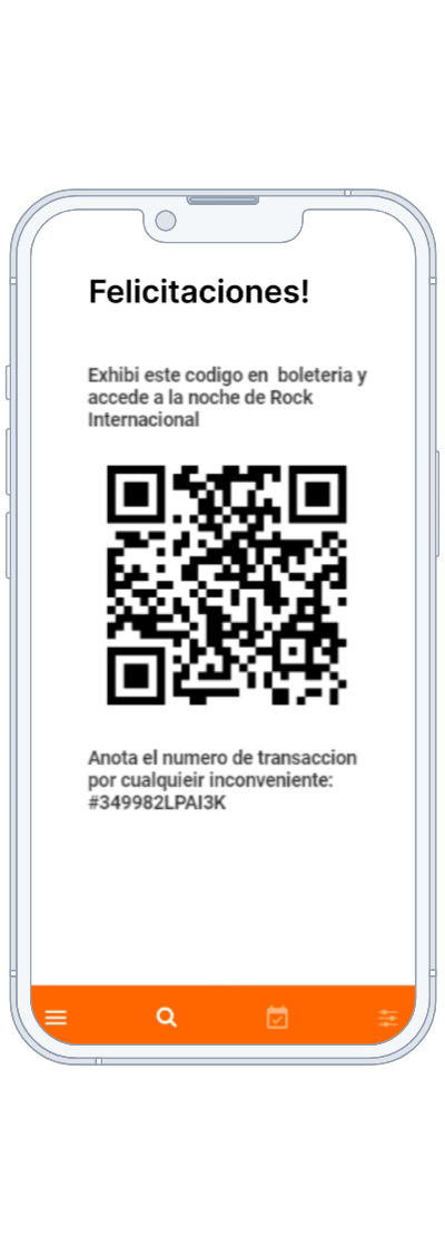
The flow of the screens to perform the task where the following
The flow of the screens to perform the task where the following
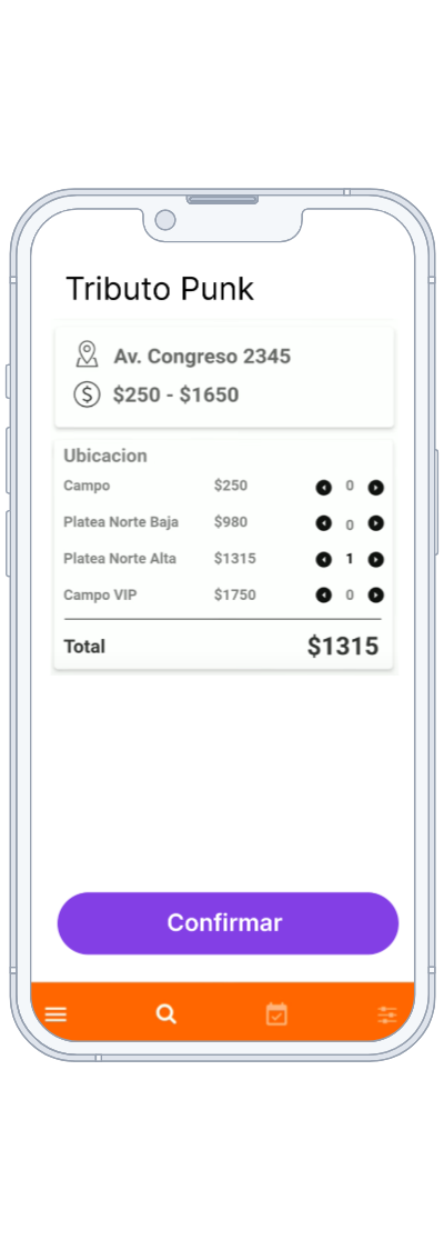
The testing resulted in a poor intuitive interface. None of the users were able to complete the flow successfully. They did not associate the points with the events, which proved to be a major problem as it is the key function of the application.
Taking into account the results of the testing, several modifications were introduced.
- One significant change that had a notable impact was the incorporation of animations for the events. Circular animations were implemented to simulate orbits around the user, conveying the concept that events are nearby.
- Another modification was made to the date picker, which was compressed and redesigned for clarity.
- Additionally, the color of the event bubble was adjusted to change when selected, enhancing visibility and user interaction.
Live Prototype
Key Learning
UI innovation can become complicated if they do not align with user understanding. UI design should resonate with users' expectations and mental models.