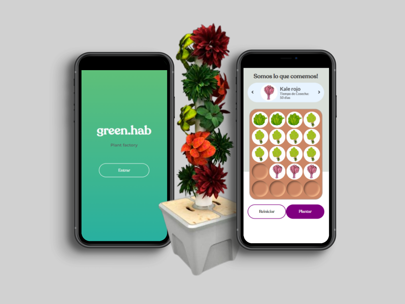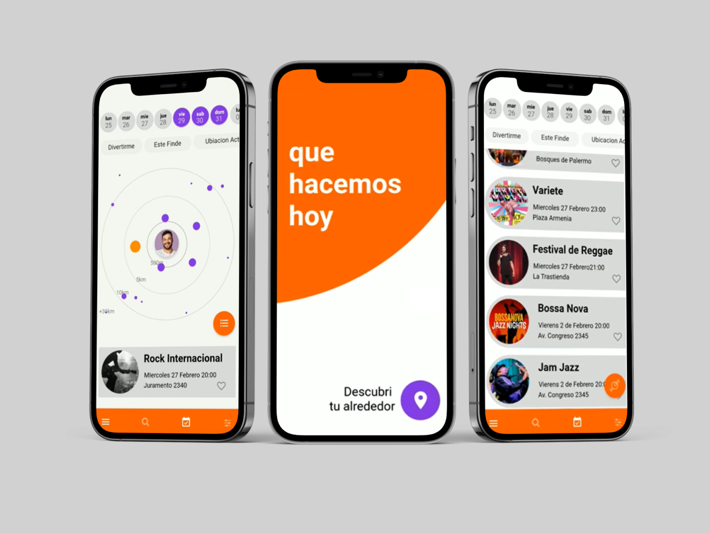
Objective
The objective of the project was reconstructing the User Interface for an inssurance software.
Segment
Insurance (Back Office saas)
My role
Product designer, Project Manager, Front end development
About the project
My goal was to create a modern, user-friendly interface that adhered to industry standards. The primary objective was to improve the user experience.
Initially, I handled both design and front-end development tasks. However, after a couple of months, the project faced challenges meeting deadlines, leading to expanding the team with additional developers. Consequently, I transitioned exclusively to UX/UI design.
As the team continued to grow, I eventually took on the role of project manager as well, overseeing the coordination and progress of the front end development as well as the design.
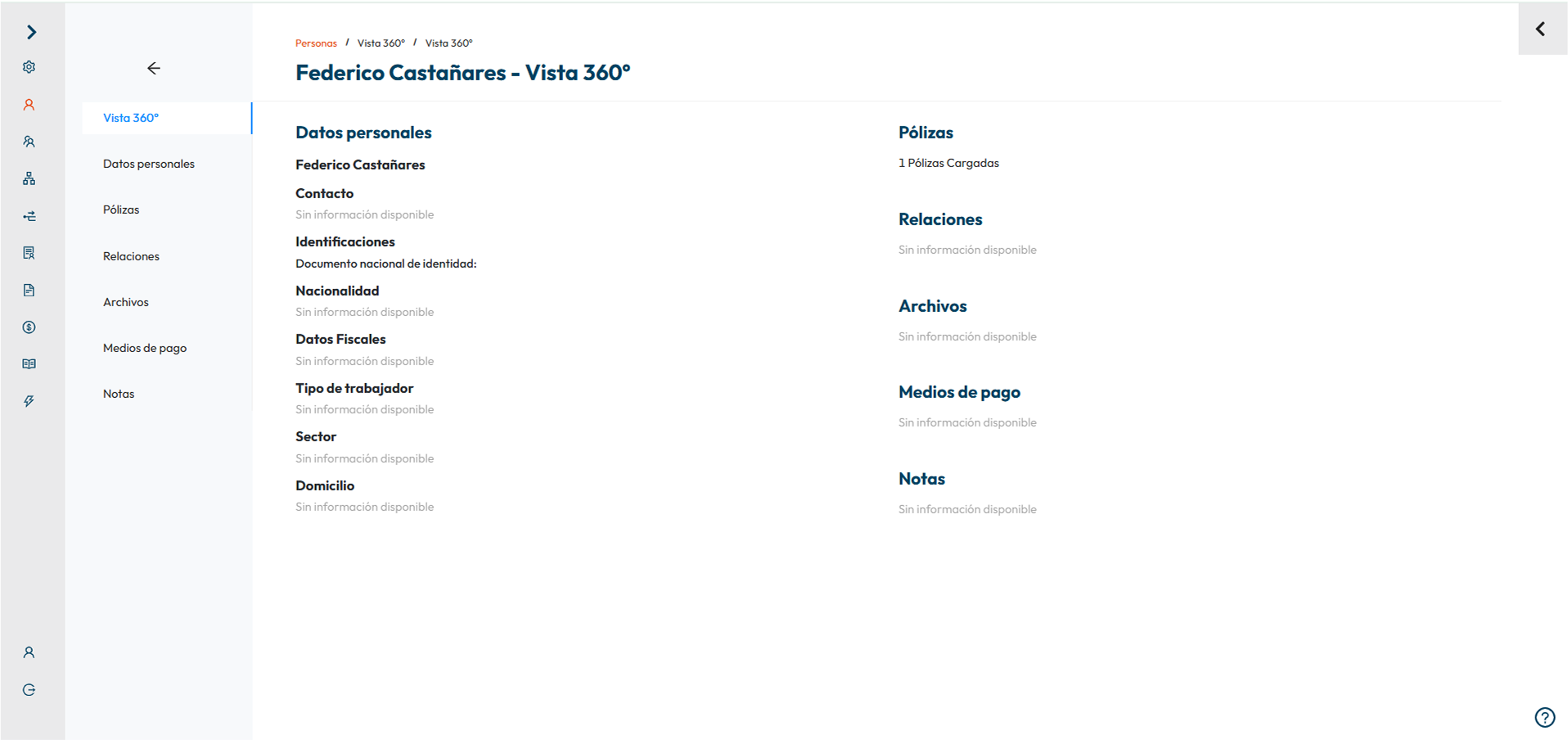
I designed and managed the development an estimate 200 screens in total.
Kick Off
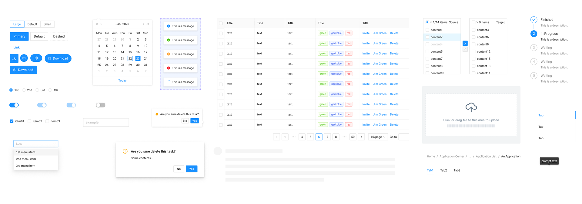
For such a complex system, choosing the UI design kit was a key decision. The options included were Material UI, Chakra UI, and Ant Design. After conducting research, Ant Design was chosen as the most suitable option.
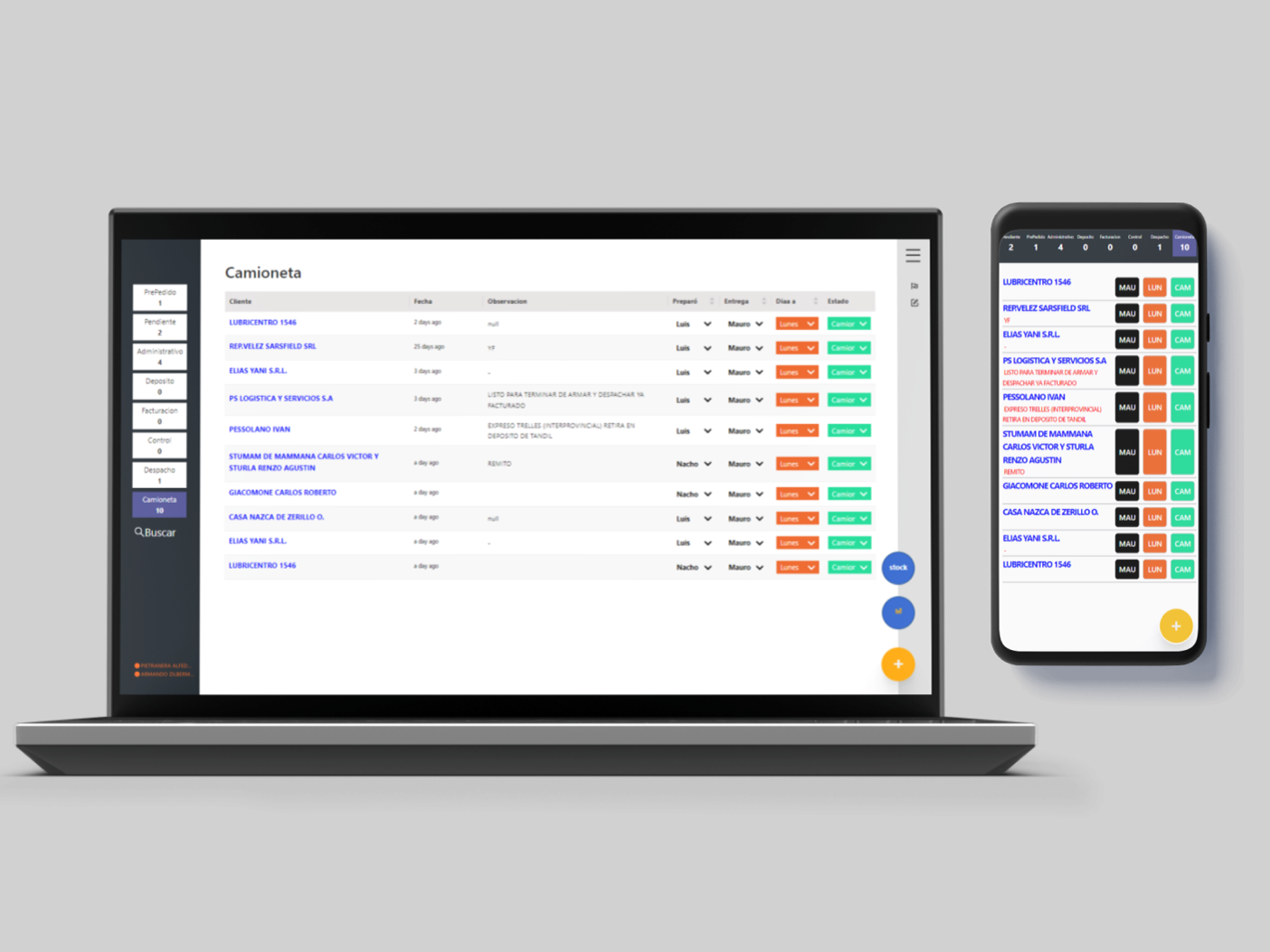
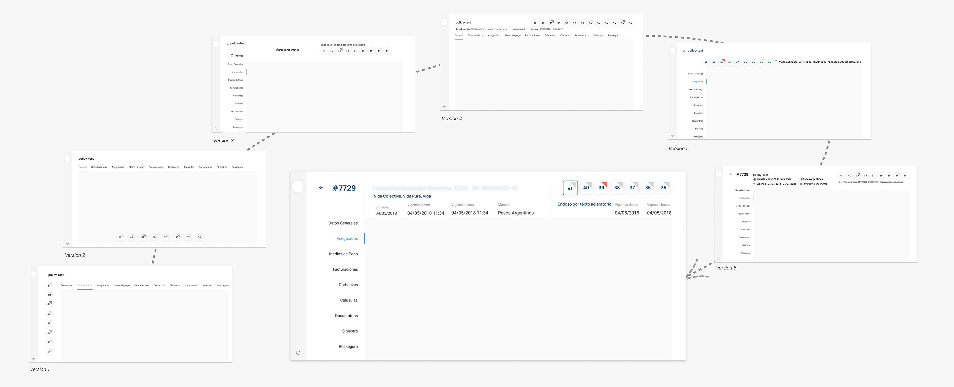
An scalable Menu layout for Micro Front End architecture
The app was developed using Micro Front Ends which implied a challenge as modules do not comunicate between each other, operating independently. Many different layouts were tested for placing the main menu (1) and the specific menu of the Micro Front End module (2).
The arising issue was that the toggling of the main menu (1) was complicated to communicate its state to the MFEs, leading to a iterarion on the design of the position of the MFE menu (2)
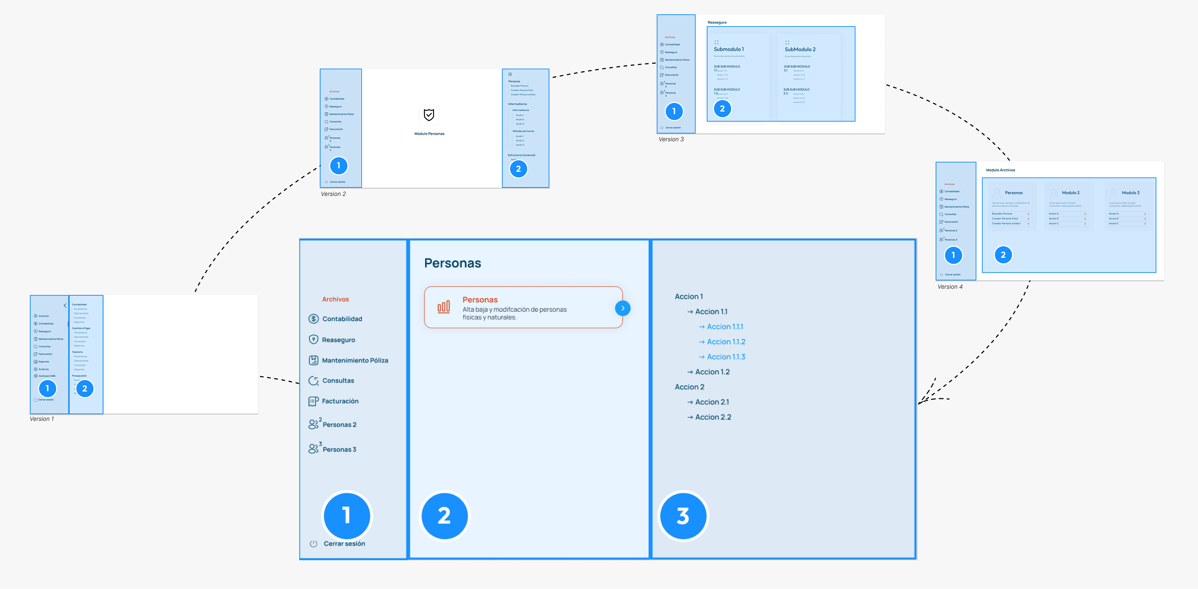
After several iterations of screens, the choice was for the layout of the menu of each module to occupy the full screen.
This implementation resulted in a flexible system capable of effectively displaying large menus.
The approach was crucial because, from day one it was challenging to anticipate the size of each menu.
Discovering the user
There was an absence of direct interaction with end users and the ability to conduct tests. This led to an approach focused on researching different systems and devising effective methods for presenting complex screens overloaded with information. Two premises about the user:
The user extensively uses the system.
As the software functions as a daily work tool, any design effort aimed at improving its efficiency is crucial.
The user performs complex processes.
Complex processes and data are managed, which can potentially lead to confusion and inefficiency if information is not managed properly.
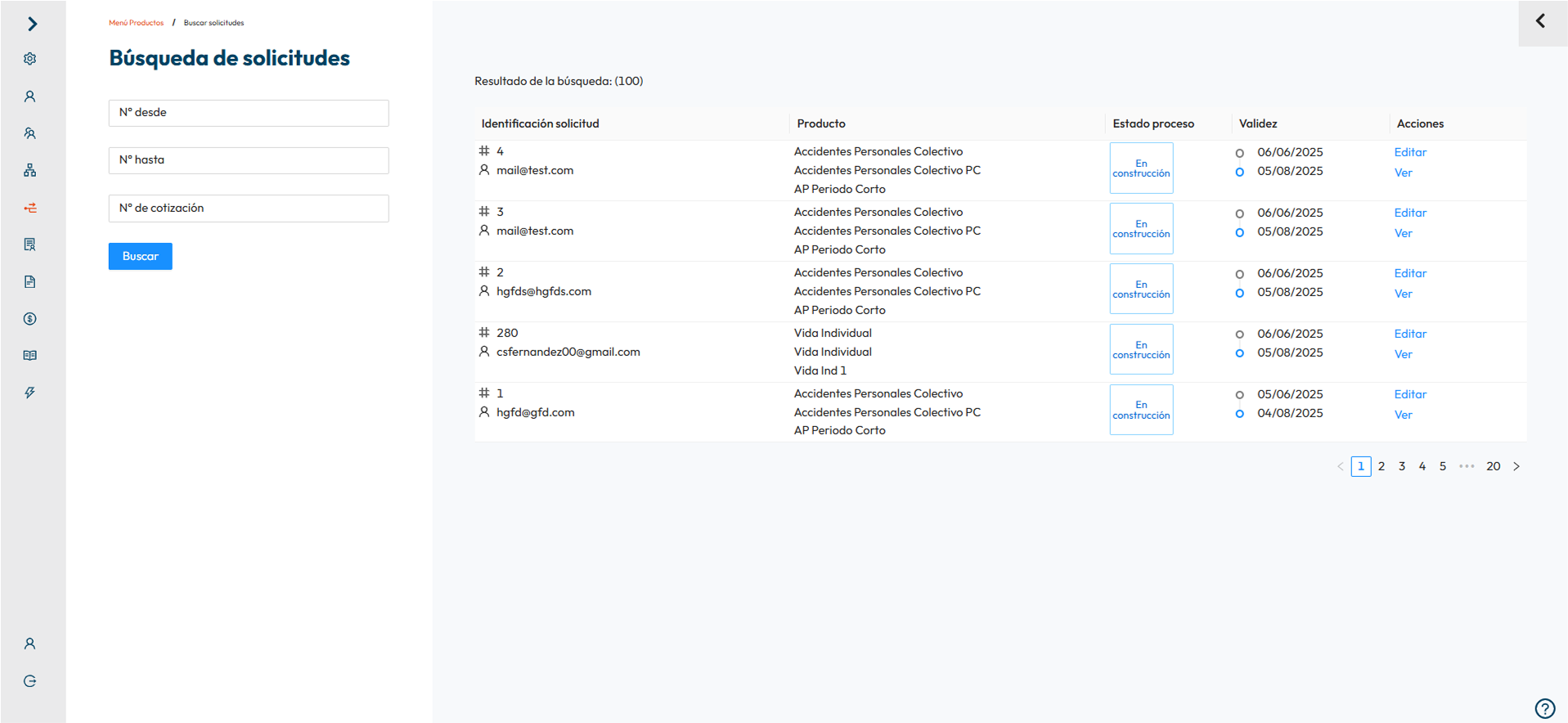
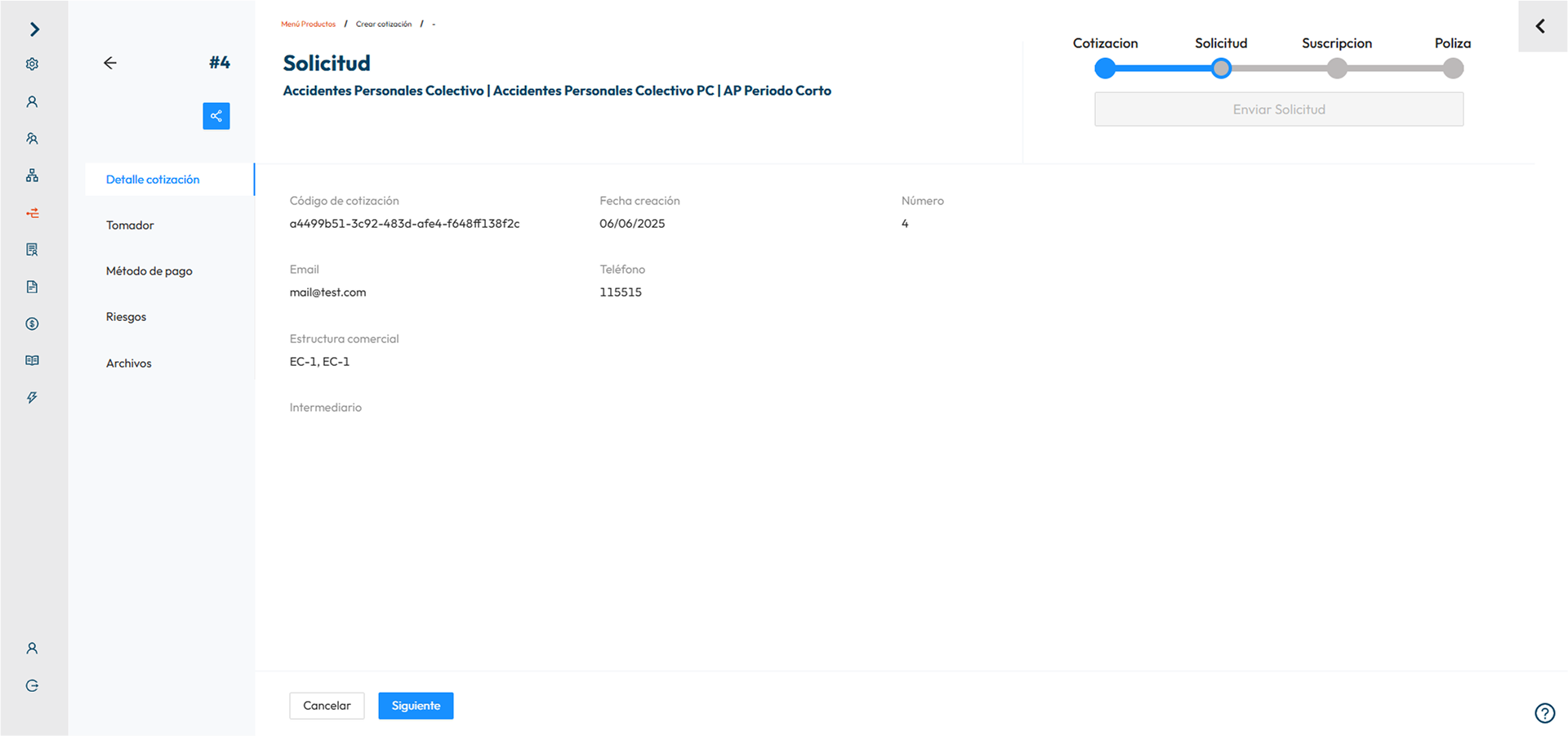
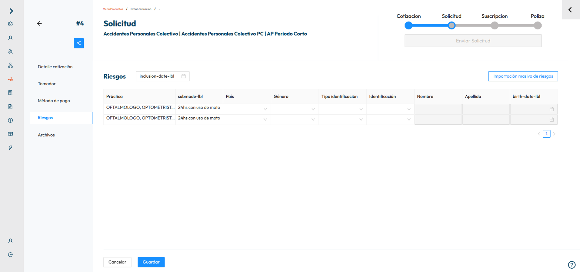
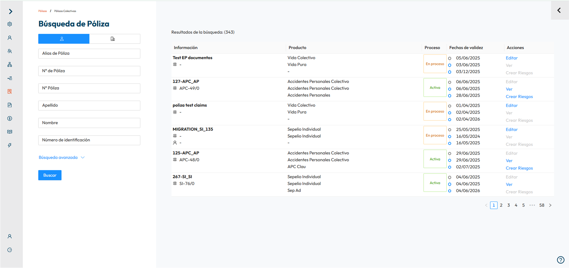
Core Screens Designed
The 4 fundamentals
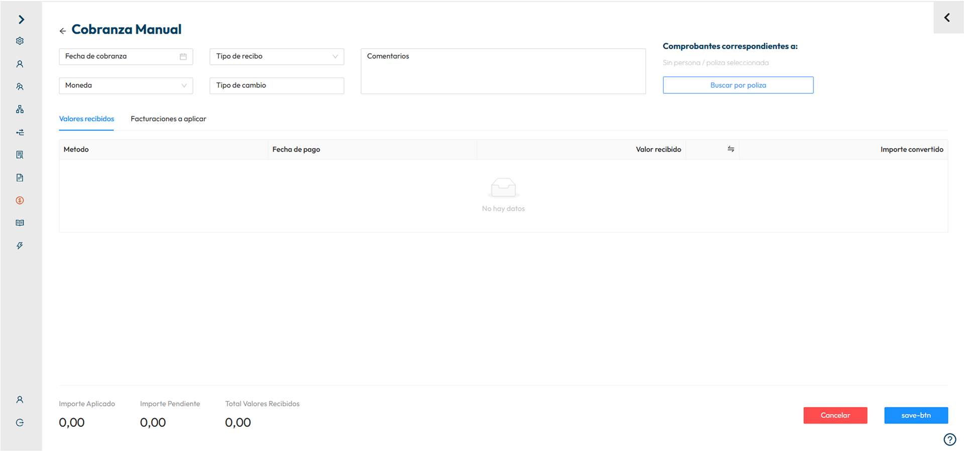
Minimal Screens
UI always aims for simplicity in design, striving for a clean and organized appearance.
Floating Labels for Inputs
Implementing floating labels for inputs is a must for saving space and ensuring a more efficient use of the screen.
Implementing floating labels for inputs is a must for saving space and ensuring a more efficient use of the screen.
Minimized Columns in Tables
Number of columns should be reduced in tables in order to avoid horizontal scrolling.
Step-Driven for Complex Screens
If a screen is too complex, the UI shall be broken down into smaller, more manageable steps.
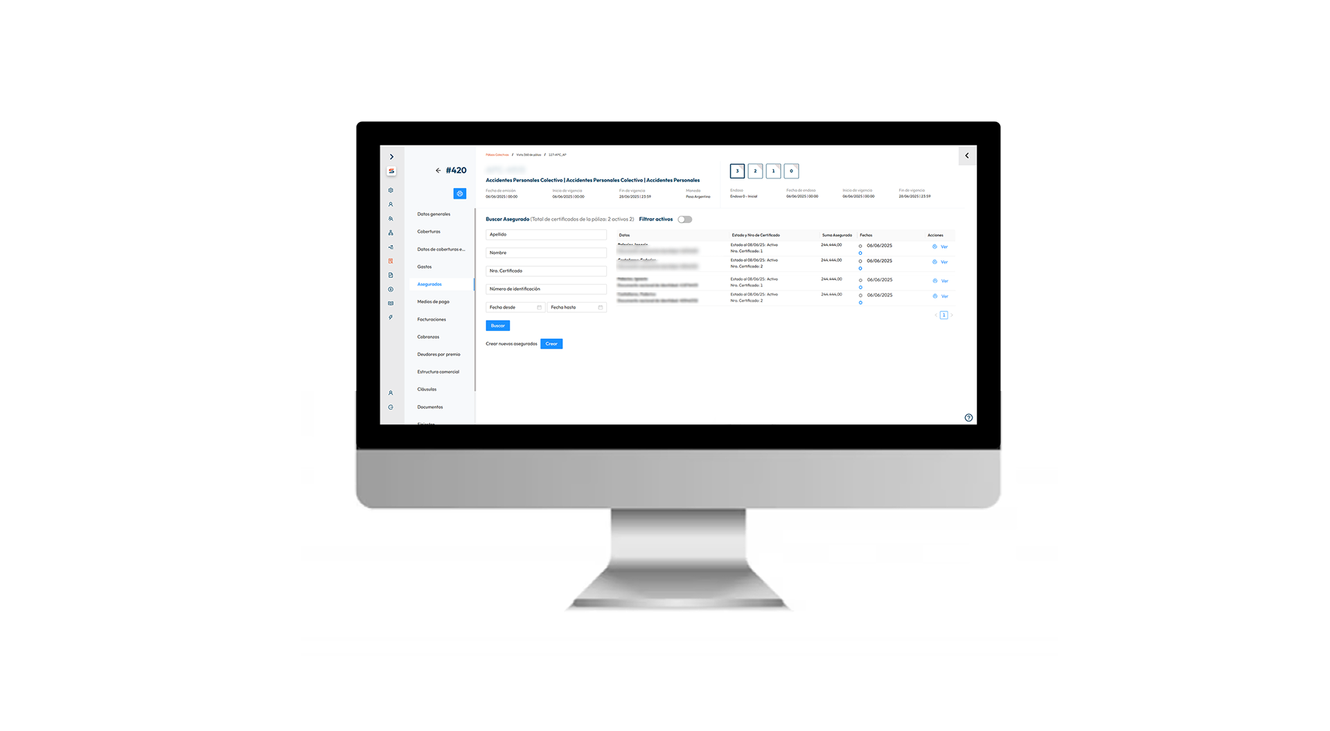
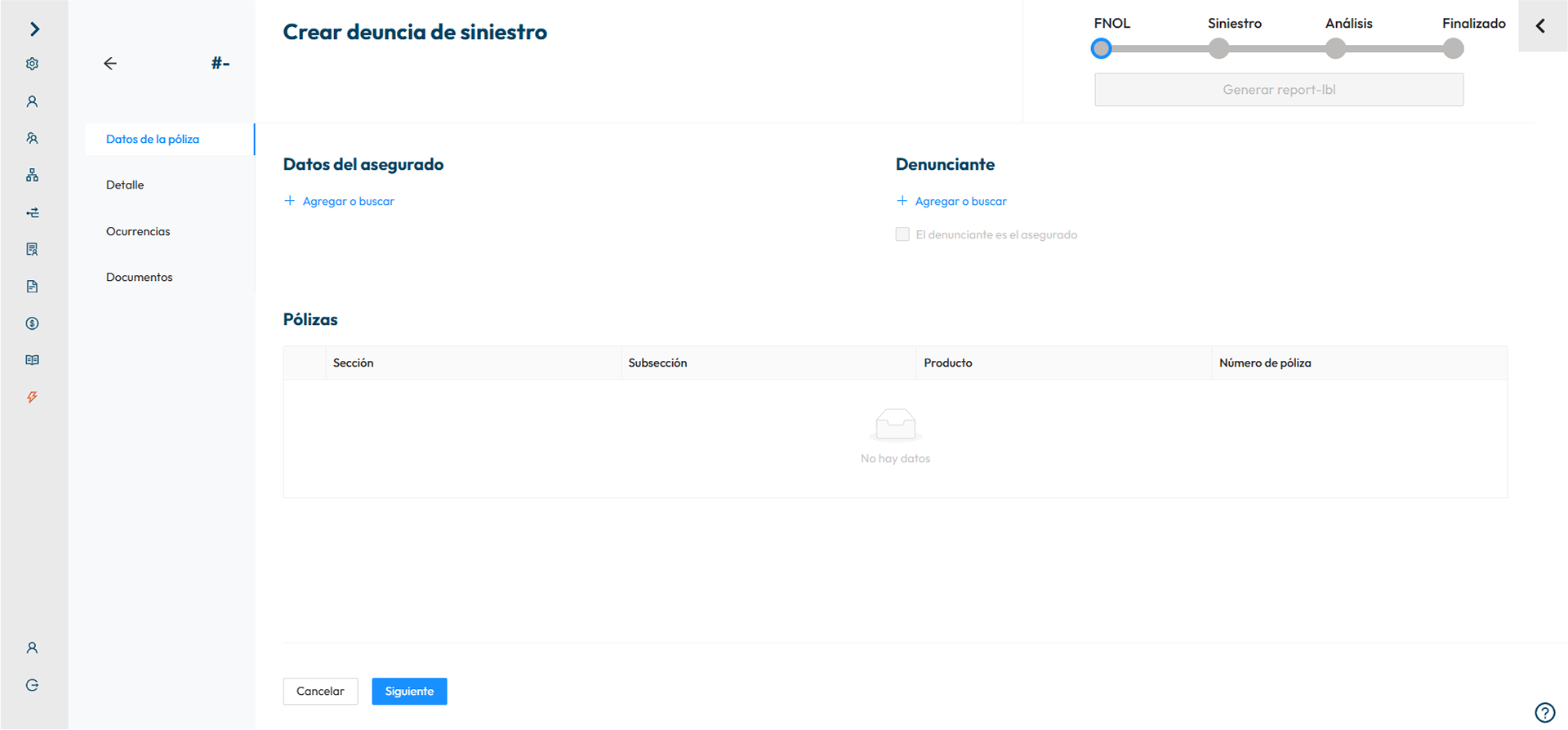
Creating a Policy
Creating a policy is a comprehensive process that involves gathering information from various sources to ensure that the policy addresses all relevant aspects and factors. This gathering of information can be quite intricate and time-consuming, often taking weeks or even longer, especially in complex or highly regulated domains.
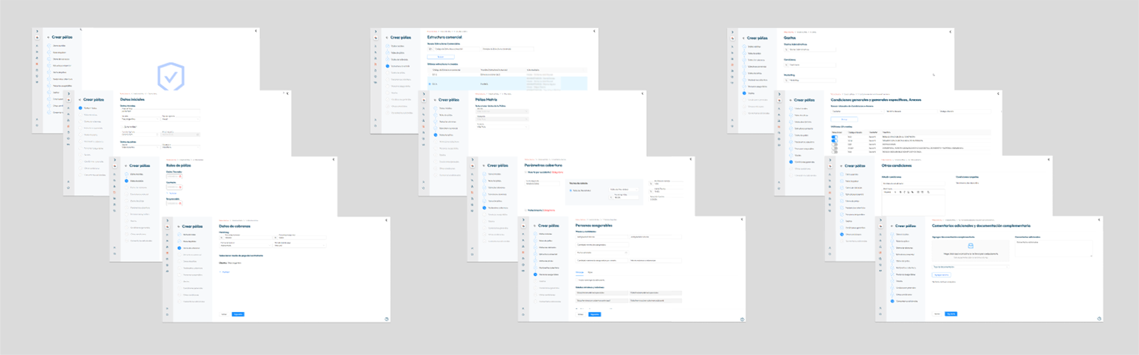
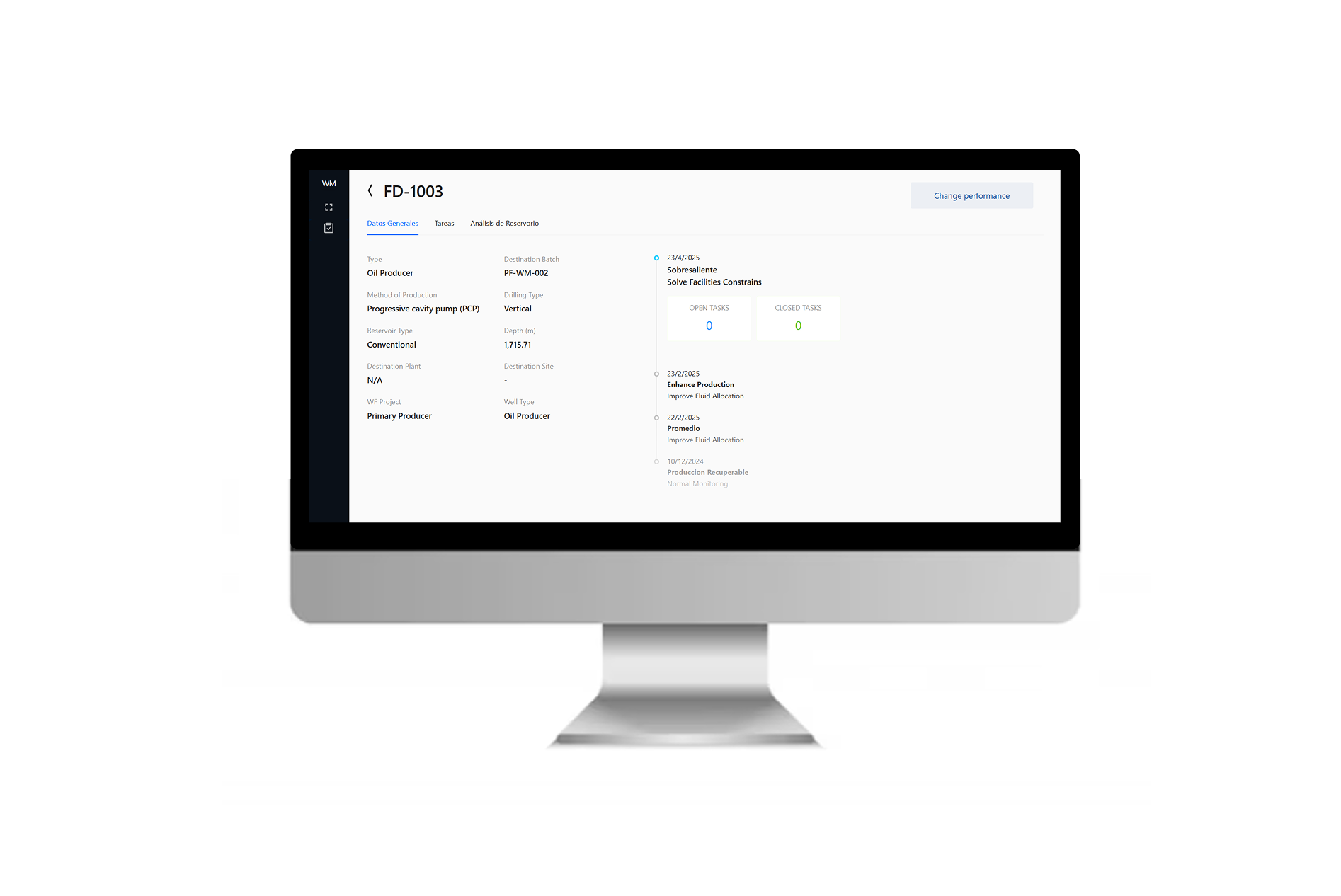
The key Screen
Among all the screens, the most intricate was the Overview of a completed policy, which was challenging due to the abundance of information.
By prioritizing feedback and testing various iterations, the optimal layout was identified, leading to an interface in which elements guaranteed maximized usability and clarity for the end user.
Challenges
Agile Prototype Iteration
Adapting from detailed documents to a swift, iterative design process posed challenges. Shifting to quick diagram-based discussions enabled rapid screen creation and multiple iterations, streamlining development.
Coordination with developers
Managing the team, task delegation, and backlog oversight were challenging. Balancing design and development priorities demanded clear communication and efficient task management to align the project and ensure progress.
Key Learning
Adapting to the different roles that the project requires in different phases can be challenging but is essential for maintaining agility and efficiency.